

Product and UX designer
Design system
Zallpy; NIX/Grupo Nexxees e Ottohx/Benner
My role : I created design systems for web and mobile to ensure consistency, efficiency, and scalability in the development of digital products. This made feature development faster for developers, accelerating deliveries.
Research and planning
- Needs: it was necessary to understand the needs to be met by the design system based on conversations with product owners and developers. I also mapped the presence of old components in web and mobile products
- Examples: understand good practices based on existing design systems (Google's Material Design and Apple's iOS)
- Objectives: improve consistency, increase team efficiency and adapt products to accessibility principles
Basic principles
- Visual Identity: the design system needs to align the product's visual elements with the brand manual, such as logo, color palette, typography, icons, and images.
- Design Principles: design decisions need to be in line with Nielsen's Heuristics


Component creation
- Methodology: I used the Atomic Design Methodology as the basis for the design systems I developed
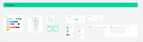
- Design Tokens: primary and secondary colors, alerts and errors, spacing grids, typography, icons and shadows. They were grouped in the Foundations category
- Atomic Components: smaller and reusable components such as buttons, inputs, checkboxes, among others grouped as Components
- Molecular Components and Organisms: more complex components that combine atomic components, such as tables, forms, modals and menus. They are also in the Components group
- Patterns: these are groups of patterns for screens such as empty states and errors
Tools used
- Figma: for creating a design system
- Zeplin: for collaboration between designers and developers.
- JIRA: for project and task management

Validation and implementation
- Usability Tests: tests were carried out with users after the implementation of the design system components.
- Training: I introduced the developers to the use of the design system with its specificities so that it could be better implemented
- Continuous feedback: the development team provided feedback on product performance and implementation to be monitored by the design system with the appropriate updates

Results
- Modular componentization: components were designed to be easily modified as needed.
- Style Guide: best practices documentation was created, explaining usage guidelines.
- Visual identity: the design system delivered components in accordance with the brand manual, making digital products consistent with the visual identity.
- Component Library: a library of components was created for different statuses, including primary, secondary, hover buttons, as well as forms, tables, graphs, etc.
- Accessibility: components comply with accessibility standards (WCAG)
- Efficiency: design systems significantly increased development efficiency and improved user experience, providing consistency and accessibility across products